Every two weeks or so One Model customers receive our product release notes and learn about all of the innovations flowing from One Model’s R&D teams. This blog series is aimed at broadening the audience to share the thinking behind our product vision and signal what’s on the horizon.
The biggest product development effort we have been working on recently relates to our updated user experience (UX). Key to this design is a deep understanding of who our users are and in a future post I’ll write some more about the different personas we consider when designing our product.
New Navigation Bar
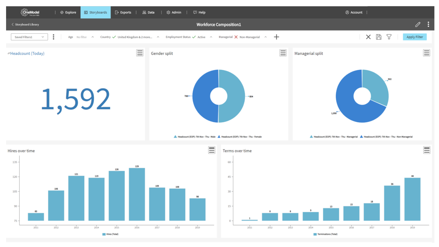
You’ll immediately notice the main application control center is now found at the top of the screen instead of on the left. More than just an aesthetic change, this is part of a new way of working that will deliver many more new features in the future. In this first release it anchors all existing a new capability seamlessly together.
Storyboards
Storyboards replace Dashboards, but a Storyboard is more than just a Dashboard with a fancy new name. This is the start of a whole new way of sharing and communicating analytical insights. From day one Storyboards will provide full backward compatibility with all of our customers’ existing Dashboards, but with that as a baseline we are moving to a whole new world of capability that is focused on surfacing insights engaging stakeholders and driving action.

Simplicity remains the overriding design principle for Storyboards. While the One Model platform is dealing with massive complexity; bringing together data from a vast array of different systems and generating a unified view of all that information, a core tenant of our product vision is to deliver an elegant user experience focused on the needs of our different users.
Storyboard Filter Bar
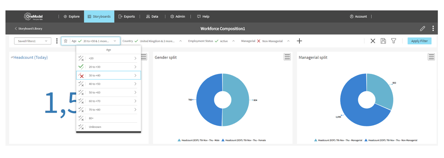
Filtering is a fairly straight-forward analytical concept, but it can be an overwhelming experience for the casual user, so we have created a whole new filtering experience that aims to provide a lot more control for the power user and greater focus and simplicity for the casual user.
For the Storyboard designer we have created an ability to control the filtering experience for end-users. A Storyboard can have the most common / relevant filters positioned at the top of the Storyboard for easy use by end-users.
End-users of the Storyboard can use the filtering controls provided for them and save their favorite sets of filters. Say you are a HR Business Partner and you are supporting two or more different business units and each of these have a different workforce makeup. You can have a filter set saved for each business unit allowing you to quickly jump between them in the context of one Storyboard and get a tailored experience with exactly the right business focus.
If you are a power user you have the ability to add more filtering controls to the Storyboard. For all users the actual controls for selecting filters is super clean with new controls we spent a lot of time developing.

Storyboards Library
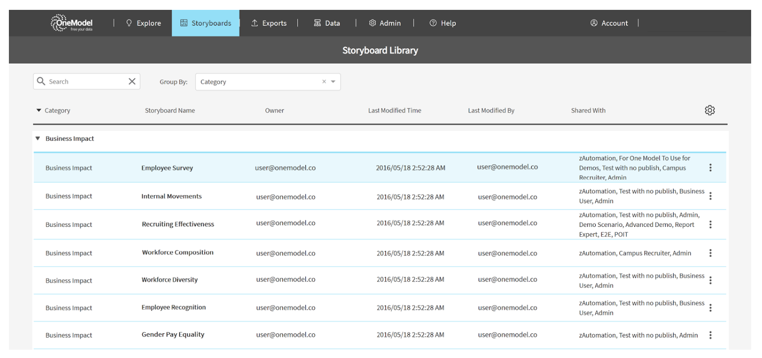
What we now refer to as the ‘classic’ Dashboard menu was a simple hover menu with a long scrolling list of Dashboards grouped into categories. The new Storyboards Library is a dedicated page that lists all of your Storyboards (including anything originally created as a classic Dashboard). You can manage and modify all Storyboard settings from this one page, e.g. sort, search, share, launch, copy, embed.

The new UX is available for customers to beta test today. I want to send a massive thank you to all of our customers who have generously shared their time and provided us with incredibly important real-world input into the designs and refinement through the beta test phase - your partnership is invaluable. Huge thanks also to everyone in One Model as this is a collaborative project across all areas of the business.
This first major release includes a lot of subtle changes to improve the intuitiveness of the application, so I’m only calling out the biggest changes in this article. The updated One Model user experience is the start of a series of innovations designed to improve the overall usability of the application based on the most requested feature requests from customers with a focus on driving end-user adoption and insight to action. We’ve only scratched the surface in this article and will share more soon.

